An effective landing page has the ability to turn your visitors into potential customers while also providing them with a positive experience.
Today, I would like to discuss a few of the most effective strategies that I have acquired over the past 12 years, which have proven instrumental in driving greater lead generation and sales outcomes.
What is a landing page?
A landing page is a standalone web page designed for a specific marketing or advertising campaign. Its primary purpose is to capture the attention of visitors and compel them to take a specific action, such as signing up for a newsletter, downloading an ebook, or making a purchase.
Landing pages are distinct from regular websites.
Landing Page vs Websites
| Website | Landing Page |
| Purpose | |
| The home page is like your brand's "PR site." It's not primarily focused on conversions but rather on introducing your brand, telling your story, and building trust and credibility. | The landing page's sole purpose is to drive conversions. It's laser-focused on convincing visitors to take a specific action, such as signing up or making a purchase. Content: Contains targeted content related to a single offer or benefit. It's concise, direct, and free from distractions. |
| Content | |
| It features an overview of your brand, products/services, and navigation links to different sections of the website. | Contains targeted content related to a single offer or benefit. It's concise, direct, and free from distractions. |
| Audience | |
| It caters to a broader audience, including cold organic traffic and existing customers. | Designed for specific marketing campaigns and traffic sources, targeting a particular audience segment. |
| Function | |
| Provides a comprehensive introduction to your brand, guiding visitors to explore different areas of your website. | Captures leads by offering something of value in exchange for contact information. It's a gateway to building a list of engaged subscribers. |
| Design | |
| Emphasizes aesthetics, brand identity, and a user-friendly experience. | Prioritizes conversion elements like compelling headlines, clear CTAs, and social proof. It minimizes navigation and distractions. |
Why landing pages are required?
A landing page is necessary for several crucial reasons in a successful online marketing strategy:
Focused Conversion
Unlike a website's home page, which serves multiple purposes, a landing page is dedicated to achieving a specific conversion goal. It eliminates distractions and guides visitors towards taking a single desired action, such as signing up, downloading an ebook, or making a purchase.
Targeted Marketing
Landing pages are designed for specific marketing campaigns and traffic sources. They allow you to tailor your message to match the source of traffic, ensuring relevance and increasing the likelihood of conversion.
Lead Generation
Landing pages are a powerful tool for collecting leads. By offering something of value (e.g., a free guide, webinar, or discount), you can entice visitors to provide their contact information, allowing you to nurture them into becoming loyal customers.
Measurable Results
Landing pages provide clear metrics for tracking your campaign's success. You can easily measure conversion rates, click-through rates, and other key performance indicators, enabling you to refine your approach and optimize for better results.
A/B Testing
Landing pages are ideal for A/B testing different elements like headlines, visuals, CTAs, and more. This helps you identify what resonates best with your audience and fine-tune your landing page for optimal performance.
Enhanced User Experience
A well-designed landing page offers a seamless and focused user experience. Visitors get exactly what they came for, leading to higher satisfaction and a greater likelihood of converting.
Building Trust and Credibility
A landing page that effectively communicates your value proposition, benefits, and social proof builds trust with visitors. Trust is a crucial factor in convincing visitors to take action.
Segmentation and Personalization
Landing pages can be customized based on audience segments. This level of personalization increases engagement and conversions, as visitors feel the content speaks directly to their needs and interests.
Maximized Ad Spend
If you're running paid ads, directing traffic to a relevant landing page ensures that your ad spend isn't wasted. It increases the chances of turning paid clicks into valuable conversions.
Data Collection for Remarketing
When visitors provide their contact information on a landing page, you gain the opportunity to remarket to them via email or other channels, further nurturing their interest and encouraging them to convert.
What is the meaning of Landing page Optimization?
Landing page optimisation (LPO) is the process of improving elements on a landing page to increase conversions. Landing page optimisation is a subset of conversion rate optimisation and involves using methods such as A/B testing to improve the experience and effectiveness of a given landing page.
WHY IS LANDING PAGE OPTIMIZATION IMPORTANT?
Landing pages are a key component of online marketing campaigns. A landing page is a specially designed page whose main goal is to generate sales or capture leads. Landing pages are often the main destination of paid marketing campaigns, and a lot of money and resources are spent driving traffic to these pages.
Since landing pages are focused on conversions, improving their performance can lead to significant improvements in business results. That’s where LPO comes in.
Optimising a landing page ensures that you achieve the highest possible conversion rate from the visitors who arrive at that landing page. Landing page optimisation can help you lower your customer acquisition costs, acquire more customers, and maximise the value of your ad spend.
Landing Page Optimization Checklist
Creating an effective landing page is an art that can significantly impact your online success. Here's a comprehensive checklist to ensure your landing page is optimized for maximum results:
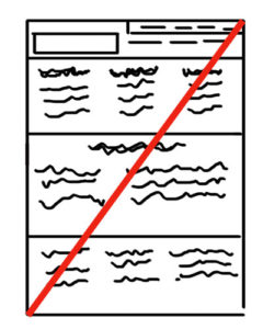
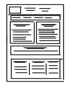
1. Keep your landing page structure neat and clean
Frequently, we come across cluttered landing pages for products/services, where multiple pieces of information are crammed together. This often perplexes visitors and makes it more difficult for them to access the desired information. Therefore, it is advisable to organize your landing page in a manner where all the relevant information is properly separated and presented meaningfully.
2. Focus the visitor's attention with a clear and concise headline
Consider envisioning yourself strolling along a city thoroughfare in search of a wine merchant. Serendipitously, a prominent sign displaying the words "wine shop" catches your eye, prompting you to pause and investigate the selection available.
Likewise, this principle applies to websites. Ensure that your headings are prominently displayed and easily comprehensible, effectively piquing the interest of your website visitors.
3. Keep enough white space
In order to address the aforementioned points, sufficient blank space should be present. The presence of blank space will facilitate the ease of reading for visitors.
4. To not clutter more information
Do not dump lots of information on your landing page. Image if you want to buy this product/service what information you would like to know before buying it? This will help you to understand customer psychology.
So keep information that is essential for the customer to know. Try to avoid extra information like “we also provide” or “we also sell”. If you really want to keep it short and sweet and in a way that it doesn’t lose the focus of our main product.
5. Images
Pictures tell a thousand words. Images help to communicate with customers easily and effectively way. Instead of writing, try to present your message through the image.
6. Keep a few options for inquiry
I have come across many websites where we find many fields in the inquiry section like the first name, last name, email address, phone number, country, message etc.
I have done many experiments for my clients by changing the number of fields in the inquiry section. I have found fewer fields give a higher conversion ratio. Even marketing analysis says that people are becoming lazy, so don’t like to fill too many fields.
So try to get the information that is most required to contact your client. Such as name, email address and message.
Tips for High Converting Landing page
Your website's landing page plays a pivotal role in converting visitors into loyal customers. It's the virtual handshake, the first impression, and a chance to make or break a deal. To ensure your landing page hits the mark, you need to incorporate these key strategies:
a) A high-value promise
It begins with an offer that contains a promise of great worth. You must communicate a single advantage that your visitor can anticipate upon engaging with your information.
Your audience is intelligent and aware of your motives for requesting their email address or phone number.
Whatever you pledge must be genuine and achievable by you. Under no circumstances should you make dishonest commitments.
b) A strong Reason. Why?
When presenting a complimentary offering, it is essential to acknowledge the internal sceptical thoughts of your visitors.
They will inevitably inquire as to why you are providing something of substantial value for free.
Consequently, it is paramount to furnish a genuine rationale for any discounts or complementary items, as this approach will contribute to the establishment of trust.
c) Authentic Social Proof
Social proof is an exceptionally formidable tool that can assuage any apprehension or uncertainty your potential customers may have regarding accepting your proposition.
Demonstrate to them the ways in which others have gained an advantage from your merchandise or services. Employ testimonials, and reviews provided by your patrons, and incorporate various screenshots similar to these examples.
d) A clear call to action (CTA)
Studies have shown that you only have between 5-10 seconds to convince your visitors to stay on your page before they bounce.
So it’s very important for you to make it clear what you offer and how they can get it in the simplest way.
Your CTA needs to be front and centre, leaving no room for confusion on where your prospect should click next.
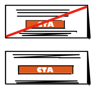
CTA should be easy to spot and use.
At least try to have two “Call To Action” on your page. One CTA should be on the first fold and the second at the end of your product or service detail. If you have a long page then you should have more than two CTA.
Try to have white space around your CTA and try to highlight the CTA button with contrasting colours to grab visitors’ attention.
e) Brand Consistency
It is essential that your marketing communication across multiple channels is cohesive, leading to your landing page, and demonstrating the dedication you provide. It is imperative to establish a clear and impactful brand voice that remains consistent in every form of communication.
And now for a bonus tip.
f) FOMO (Fear of Missing Out)
This strategy has consistently been effective for me.
When presenting a discount or complimentary offer, it is important to generate a feeling of urgency and exclusivity.
The fear of missing out motivates your target audience to take action promptly.
g) Different Landing Pages to answer different problem
If you have developed various campaigns aimed at distinct areas of concern and target audiences, then you should generate separate ad copy for each landing page.
h) Keep your copy short and sweet.
As the famous Albert Einstein once said, if you can’t explain it simply, you don’t understand it well enough. And if you don’t understand it, your audience won't understand it. Got it?
Tools for Landing page optimisation
Heatmaps, one of my favourite tools gives really good insights on how visitors interact with the websites.
Heatmapping software allows you to identify areas that require enhancements. Heatmaps provide a visual depiction of website components that receive the most (hot) and least (cold) interaction, using colours.
By observing the areas that users click on, scroll through, or pay no attention to on specific pages, you can gain a better understanding of what modifications to make, what to test using A/B testing, and what aspects to enhance. This way, you can enhance the user experience for your audience.
These are a few sources that will assist you in comprehending the benefits of heatmap tools in enhancing your landing page and increasing conversion rates.
1. Clicks Session
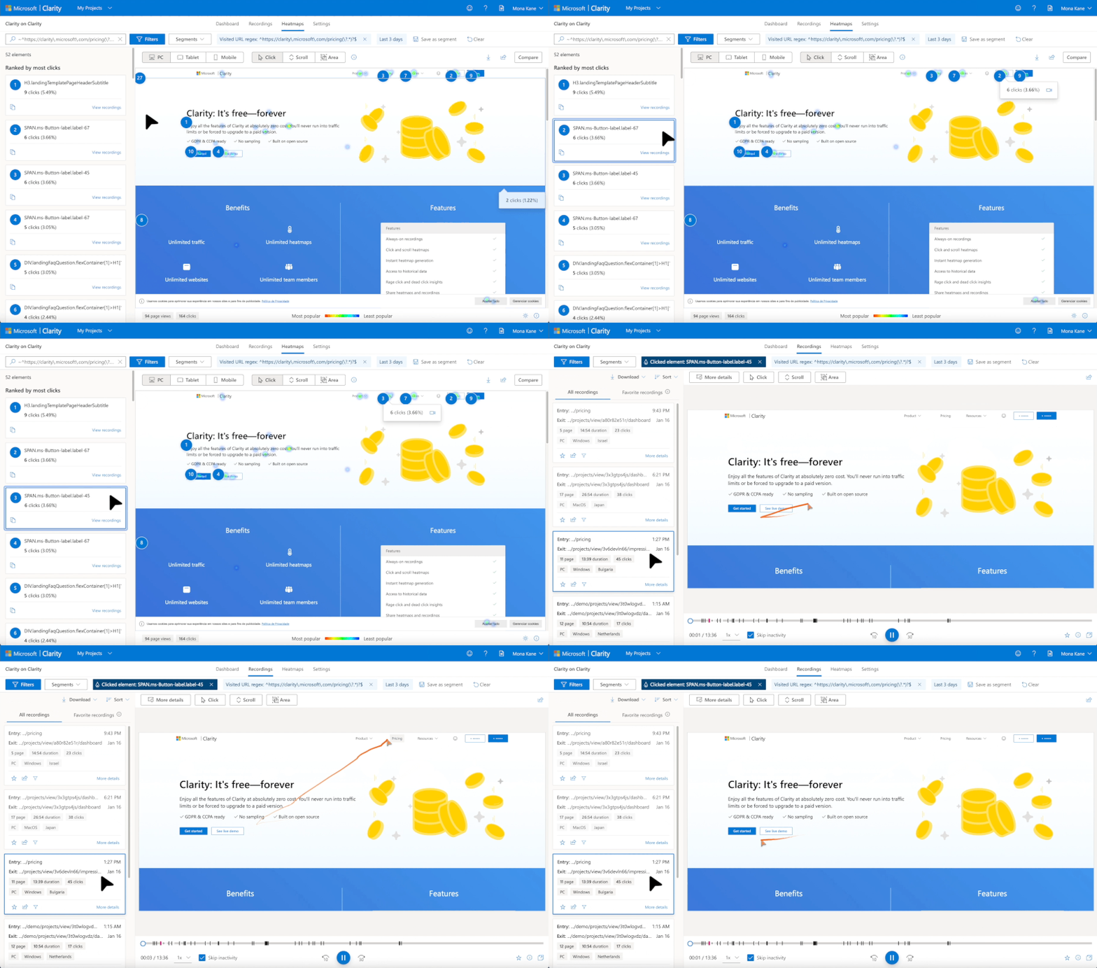
2. Scroll Session

3. Recording Session
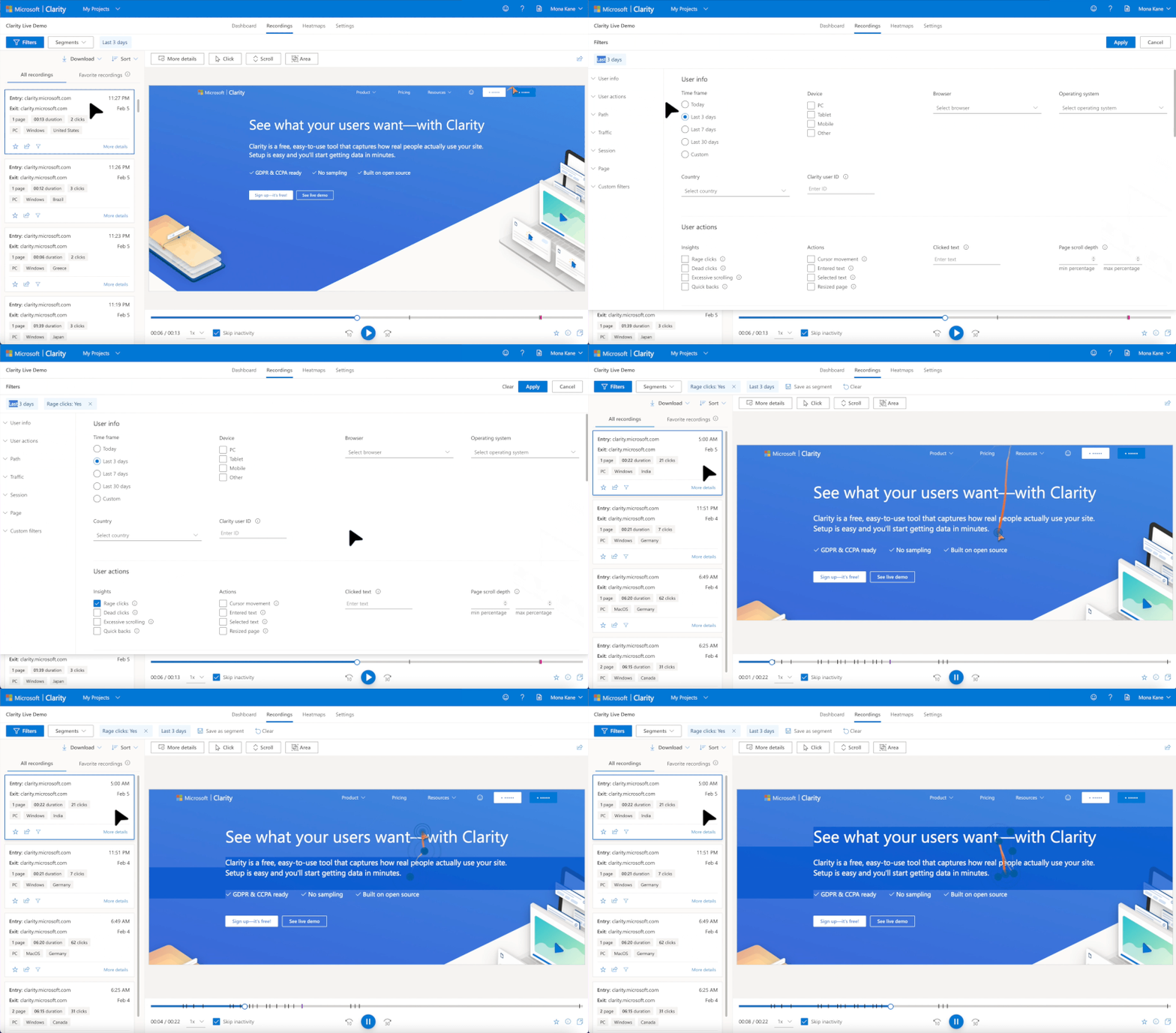
Here are the Top 5 Heatmap Tools
- Microsoft Clarity (Free Tool)
- Heatmap.me (Free Tool with limitations)
- Hotjar (Free Tool with limitations)
- Crazy Egg
- Inspectlet
In conclusion, landing page optimization is the key to unlocking your online marketing potential. It's the art and science of creating landing pages that convert visitors into loyal customers, reducing acquisition costs and maximizing ad spend value. Simplify, clarify, and use authenticity to make landing pages that guide visitors toward action. With tools like heatmaps and a commitment to ongoing improvement, you can create landing pages that align perfectly with your marketing goals. In this dynamic digital landscape, continuous optimization is the name of the game. So, embrace these strategies and tools to elevate your business to new heights.


